5 pitfalls to avoid when planning your garden (or 5 top designers hacks for genius gardens!)
Ok slight disclaimer here – the “wrong” examples I show here are to make a point – there is nothing “wrong” with your garden as long as you love it and enjoy your space. I have deliberately tried to find examples that are otherwise attractive rather than just travesties of garden design, because I am trying to demonstrate a single point each time.
Many people create wonderful spaces without the intervention of a know-it-all designer and I would never presume to tell someone their taste was incorrect – thank goodness we don’t all love the same things! Having said that, there are some things that pretty much always make the result look less good (or much better!) to most people. Playing the odds is therefore a good start to a garden design, and a skilled designer will tease out of a client what will work for them and where to break the “rules”.
I would very much welcome images from people whose lovely gardens break all these rules and still look great and bring them lots of pleasure – it would make another interesting blog!
1) Making the planting beds too thin
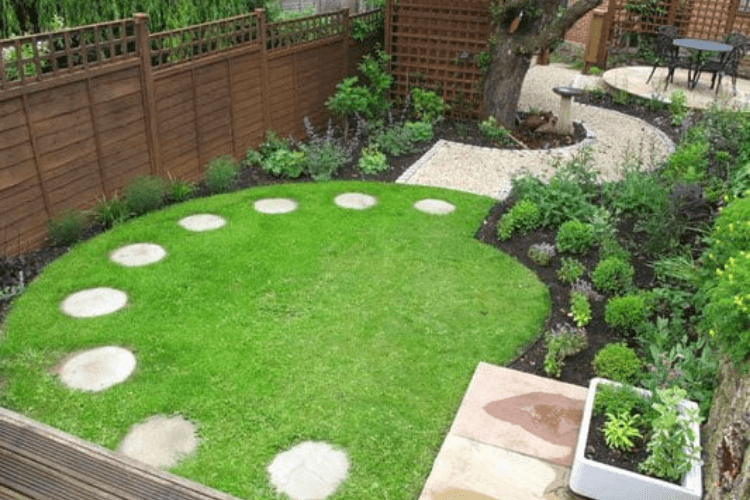
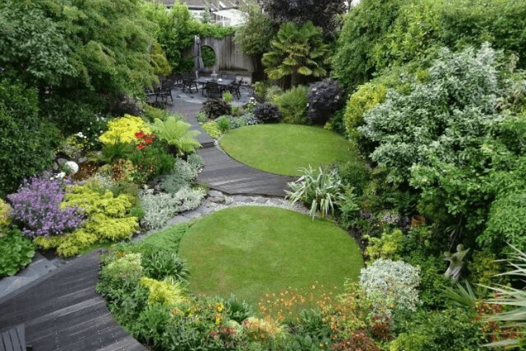
I hear all the time from clients – I want maximum lawn, I want the space to be as large as possible. Funnily enough, pushing the lawn to the edges tends to make a garden feel barren rather than spacious. Clothing the garden in planting usually gives a feeling of privacy and lushness, enclosing the 3D space (ie above the lawn level) and thereby giving more of an illusion of space. The two gardens below are actually almost the same size but the treatments are very different…
Whilst the first garden looks “designed” and pretty, the bed on its left side left is too skinny to give depth and colour, and draws attention to the fence which is rarely the ideal focal point. The image beneath is a good example of “losing the boundaries” with thicker planting. Given the lawn is not likely to be used for much more than a small picnic – neither are large enough for football – making them tiny handkerchiefs works fine.
Even in a really tiny space, the trick is to get some deeper pockets of planting even if other parts of the hard landscaping go right to the boundaries, this creates movement and interest, a great example below…..
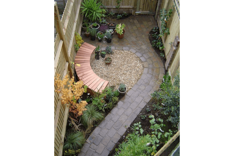
With circles you can get away with the narrowest part being really quite slim – this is a slightly more efficient use of the space as you inevitably get a deeper section you can plant something larger in, and this gives a much better impression of bulk. You can’t go as narrow with the beds on a square shape.
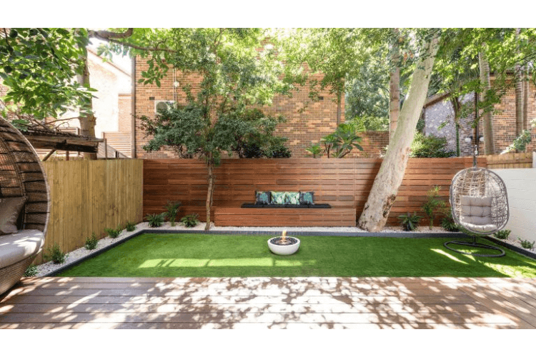
The image below is a well finished garden, but will always feel bare. The lack of any depth to the beds makes it hard to plant anything with height and bulk (unless you love bamboo or are happy with just climbers), and the tiny plants round the edge just draw attention to the problem. I would probably have created a deep bed on the right side leading to the swing chair (and under it), and removed the bed entirely on the left – the bench is not centred on the rear space anyway, and this would make the garden feel more balanced.
The image below shows what a good depth of planting can achieve, whilst still being very neat, feeling spacious, and extremely low maintenance.
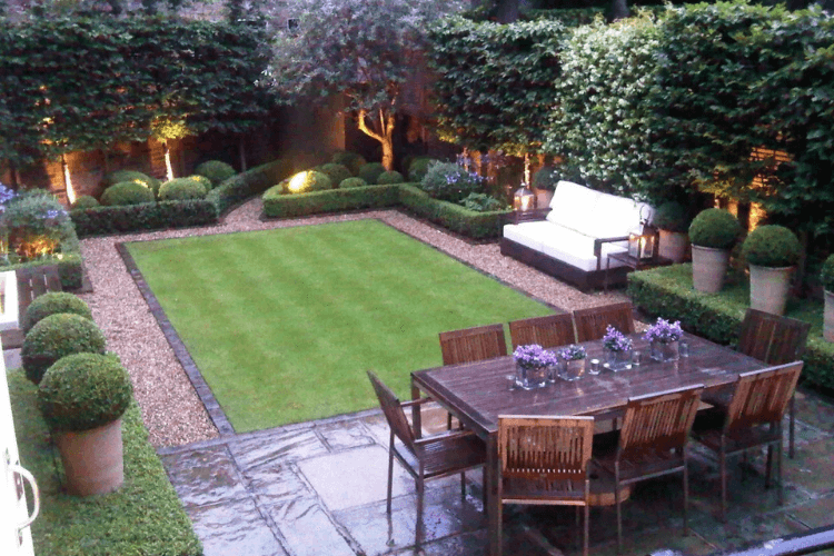
In terms of maintenance – lawn is typically more maintenance than well chosen planting – whilst planting can feel scary to some, it really shouldn’t be!
2) Using small things in small gardens
The head-room in a garden changes the way proportions work versus those most people are used to inside a house. In small spaces you are almost always better off using a few large shapes/objects/features than little ones.
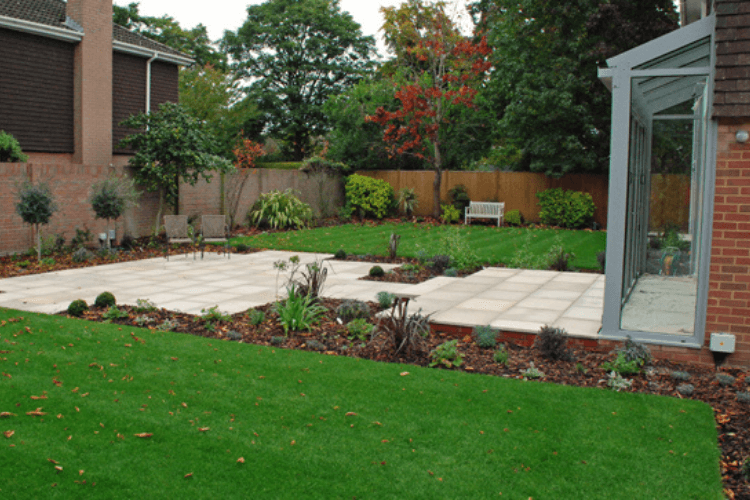
In the image below the planting is small (and will grow so this is not at all a fair reflection of this designers art – I am just making the point!)
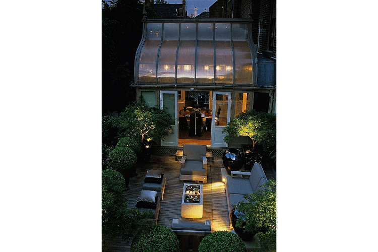
I have long thought this wonderful roof terrace by the fabulous Luciano Guibbilei is the most wonderful example of a great use of scale and proportion…..the pots and sculptural shapes are huge and make the space feel grand yet intimate – clever stuff!
3) Odd angles
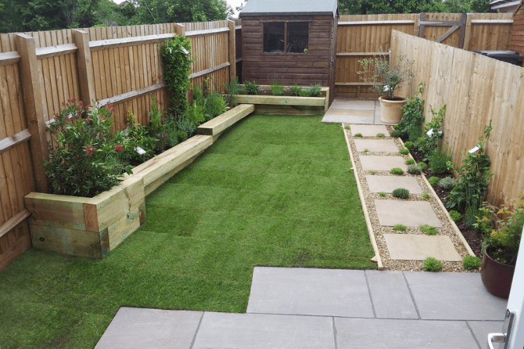
In general, line things up with the house and NOT the boundaries – this is why simple grid style patterns work well and are beloved of garden designers. Create the main lines in hard landscaping and plant between these and the boundaries to lose the awkward spaces. This shouts “order” to our simple brains. Anything off this angle will stick out like a sore thumb…The raised bed to the left of this image is “off” relative to the path and patio, but on its own might have been ok as a narrowing of apparently parallel lines feels acceptable to us (think railway tracks), but the angle of the paving at the rear, in front of the shed really jars. It’s a small space and has been done with love and care, but from a design point of view could have been much more effective without costing any more.
In this example the deck in the corner is at an angle that just feels very uncomfortable..
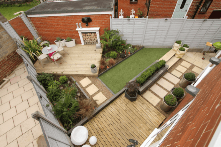
The example below is a good example (by Future) of a small garden created in an angled plot
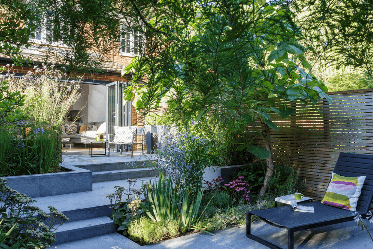
The angles chosen can be “off” versus the house as long as they are consistent- using a diagonal can create a sense of width. Try drawing a grid across a plan of your plot and ensuring that all the lines fit that grid. In the example below the designer has started this, but then put the bench in at odds with the geometry of the garden which spoils the effect. This then draws attention to other lines that are not parallel (the side of the deck is not parallel to the first section of path for example).
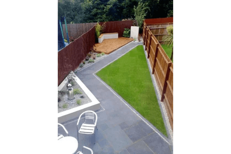
The example below is “correctly” done and feels more harmonious to me.
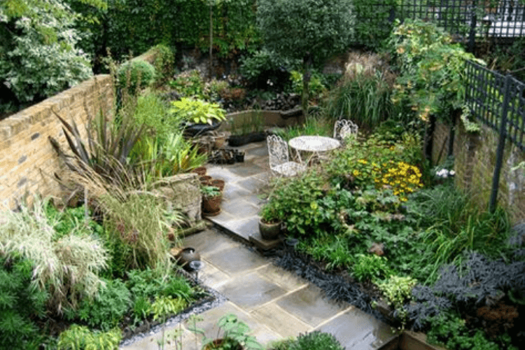
4) Wibbly wobbly lawn shapes
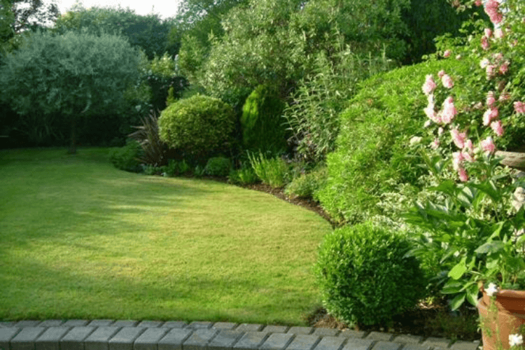
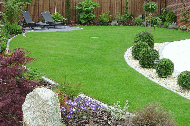
Do not think that wibbly wobbly lines look natural – they don’t! Natural lines are typically quite geometric – good sweeping curves or straight lines in a garden typically look much more natural and restful. If you want the lines really softened then create deep planting beds with planting flopping over. The examples below to me just look wibbly wobbly…
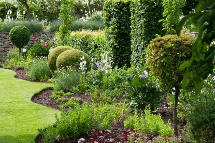
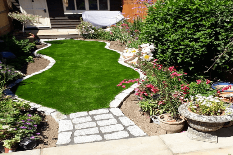
Whereas these look elegant and as natural as a manicured garden with mown lawn can!
5) Too many different materials
Aim for a single material at each unit size and preferably no more than 3 eg. wooden deck, setts, and gravel. If you already have brick walls then that is probably your sett sized unit – you can carefully use more, but always try to strip back. Try to make the wall claddings/trellis/sleepers etc all part of this and still keep the number of different materials to a minimum. If you have to use an extra one then make the colour tone.
In the example below the grey wood on the table, gravel and light pavers and rendered walls jars with the tan wood on the deck and the fencing as well as the mulch (although you won’t see that for that long!). I would have recommended using a grey deck and fencing. I would also keep all of the paving to a single unit size – the odd small ones stand out. Particularly given the variegated planting and yellow tones I would have aimed for a much more muted colour set in the rest of the materials. The designers may of course be expecting the wood to tone down to a grey (which it will without treatment), and I think it will look much more harmonious then.
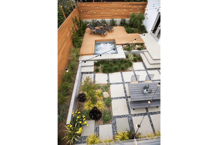
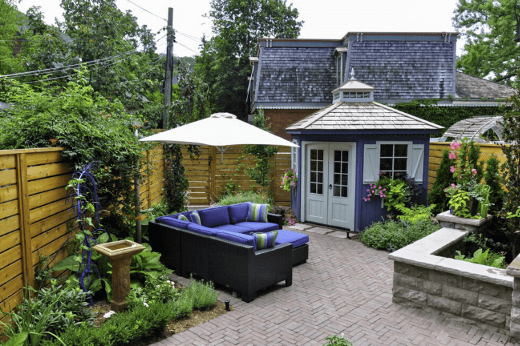
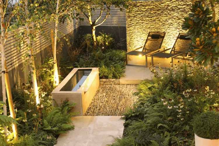
The example above shows nice shapes, but I feel has at least one material too many – particularly because the grey tile in the adjacent house is effectively part of our garden, certainly from this angle. If this were partially screened with trees it would reduce the “business” of this garden by effectively reducing the number of materials used. I would also consider painting the fence to match the furniture perhaps (the summer house colour would be too much), and/or cladding the pool surround to tone more with the paving as has been done so beautifully in the example below by Daniel Shea Garden Design.
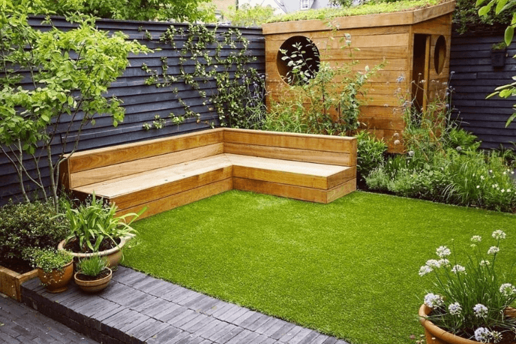
A really simple example is below (by Garden Club London) – matching the shed cladding to the bench is genius! This also shows a top designers trick of painting fencing black – this sounds odd but works a treat.
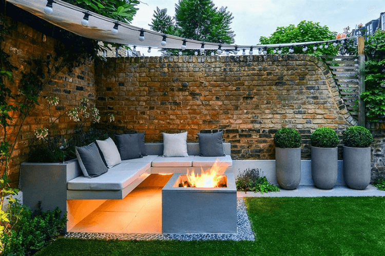
Any dressings like pots and furniture need to tone carefully – try to keep the pots co-ordinated, and in general much larger than you expect. I think the example below (by Blissful Gardens) is beautifully harmonious and shows the value of matching a “busy” material like the brick wall with very plain smooth render and paving.
CGLA are an award winning team of Garden Designers, Landscape Architects, Landscapers and Garden Maintenance Operatives working in Buckinghamshire, London and the South East, as well as on prestigious design projects across the UK and abroad. We are currently working in Oman, Jersey and France, and welcome enquires for design, landscaping or garden maintenance. Contact us here
